Last class, Zain and I decided to start thinking about how we want our social media to be presented, so we started brainstorming on ideas for the "logo", which would be the profile picture of the Instagram for "Out of hand"
Our initial design looked like this:
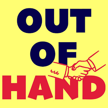
And we thought it was great enough, but Martina brought us back to reality and told us to make a few changes that made a significant difference.
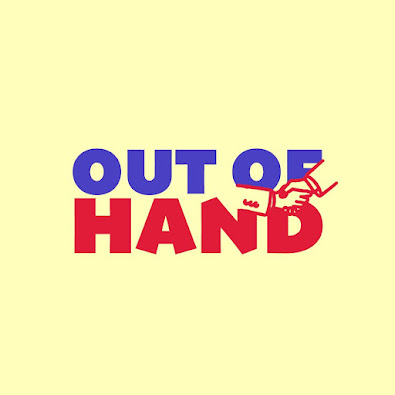
The colors are less abrasive and tacky looking, and the font is spaced out much better now. We took inspiration from the simple, typical sitcom logos, such as from "The office", but decided to include the color scheme of the office location we are shooting at (yellows, blues, red).
Following this same color scheme, we also made a mood board for how we want our main character to dress/the vibe we want him to give off. We want our main character to give off that nerdy, kind of odd guy that you see in sitcoms, such as Dwight from The Office or Micheal Cera's characters.


.jpeg)


No comments:
Post a Comment